Color has a powerful effect on how a small apartment looks and feels. The right shades can make tight rooms appear brighter, calmer, and more open, while the wrong ones can make the same space feel boxed in and heavy. In small apartment design, color is not just decoration. It helps shape light, define mood, and influence the sense of space. Soft neutrals, airy whites, gentle grays, and carefully chosen accent colors can visually stretch walls and make ceilings seem higher.
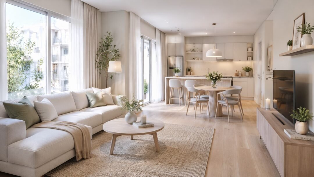
This guide explores the best color ideas for small apartments, from living rooms to bathrooms, and explains how to use them wisely. With the right approach, color can become one of the most affordable and effective tools for making a compact home feel larger.
Why Color Matters in Small Apartment Design
Color does much more than make a room look attractive. In a small apartment, it influences how large, bright, and comfortable a space feels. That is because color affects how light moves through the room and how clearly the edges of walls, ceilings, and furniture are perceived.
Lighter colors tend to reflect more light, which helps a room feel open. Darker shades absorb more light, which can make a room feel smaller if they are used too heavily. But color is not only about light reflection. It also changes the mood. Soft and balanced tones often make a space feel calmer and less crowded. Loud, overly saturated colors may feel energetic, but they can also make a small room feel visually compressed.
Why color choices matter more in small spaces
- There is less room for visual mistakes
- Color is more noticeable when walls are close together
- A poor palette can make clutter feel worse
- Good color choices help unify small rooms
What color can do in a small apartment
| Effect | Result |
|---|---|
| Reflect light | Makes rooms feel brighter |
| Reduce contrast | Makes walls feel less boxed-in |
| Create harmony | Helps the apartment feel calmer |
| Add depth | Makes the layout feel more intentional |
In small apartments, color works best when it supports the function of the room. A bedroom may need softness and calm. A kitchen may need brightness and cleanliness. A living room may need warmth without heaviness. When color is used thoughtfully, it becomes one of the easiest ways to make a compact home feel bigger and more inviting.
How Light Affects Color in Small Spaces
A color can look completely different depending on the amount and type of light in a room. That is why choosing paint from a sample card alone often leads to disappointment. In small apartments, light conditions matter even more because limited windows or awkward layouts can change the mood of the entire room.
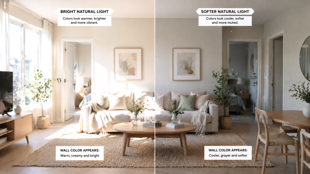
Natural light reveals undertones. A soft gray may look airy in a sunlit room but cold in a dark apartment. A warm beige may look elegant in afternoon light, but yellow under artificial bulbs. This is why the same color can feel spacious in one apartment and dull in another.
Main lighting factors to consider
- North-facing light: often cooler and softer
- South-facing light: brighter and warmer
- East-facing light: gentle morning brightness
- West-facing light: warmer afternoon and evening glow
Color behavior in different lighting
| Light Condition | Color Effect |
|---|---|
| Bright natural light | Colors look clearer and lighter |
| Low natural light | Colors look deeper or duller |
| Warm bulbs | Beige, cream, and warm gray look richer |
| Cool bulbs | Whites and blues feel sharper |
Before choosing a wall color, test it on different walls and watch it during the day. Morning, midday, and evening can each reveal something different. This step saves money and prevents the room from feeling too cold, too dark, or too flat.
Lighting and color should work together. When they do, a small apartment feels more open and balanced. When they do not, even a good color choice can feel wrong.
The Best Neutral Colors for a Bigger-Looking Apartment
Neutral colors are often the safest and smartest option for small apartments. They create a calm background, reflect light well, and make it easier for furniture and decor to feel connected. But neutral does not mean plain. A well-chosen neutral palette can make a room feel soft, spacious, and surprisingly elegant.
The best neutrals for small apartments usually have subtle warmth or softness. Harsh, flat tones can feel lifeless, while well-balanced neutrals make the apartment feel more refined and open.
Top neutral directions
- Soft white
- Warm ivory
- Light beige
- Pale greige
- Gentle gray
- Sand or oat tones
Why neutrals work so well
- They create visual continuity
- They pair easily with different materials
- They help small rooms feel less busy
- They make changing decor easier later
Best neutral types by mood
| Neutral Type | Best For |
|---|---|
| Warm white | Clean but inviting spaces |
| Beige | Cozy, welcoming rooms |
| Light gray | Modern, airy apartments |
| Greige | Balanced and versatile design |
| Sand tones | Natural, relaxed style |
One reason neutrals make a room feel larger is that they do not demand too much attention. Instead of breaking the room into many strong visual sections, they allow the eye to move smoothly across walls and surfaces. This continuity can make the apartment feel more expansive.
Neutrals also support layering. Texture, natural light, wood tones, plants, and fabrics become more noticeable when the walls are simple. For small apartments, that balance often creates the most timeless result.
Soft White Shades That Open Up a Room
Soft white is one of the most effective color families for making a small apartment feel larger. White reflects light beautifully, creates a sense of cleanliness, and helps the boundaries of a room feel less heavy. But not all whites work the same way.
A bright, stark white can sometimes feel cold or too sharp, especially in apartments with limited light. Softer whites with warm or creamy undertones usually create a more welcoming atmosphere while still opening the room visually.
Benefits of soft white
- Makes walls feel less heavy
- Reflects both natural and artificial light
- Works with nearly every decor style
- Creates a fresh, timeless base
Soft white styles to consider
- Warm white
- Creamy white
- Off-white
- Ivory white
- White with subtle beige or gray undertones
White choices and mood
| White Type | Mood |
|---|---|
| Crisp white | Clean, modern, sharp |
| Warm white | Soft, inviting, balanced |
| Creamy white | Cozy, classic, relaxed |
| Gray-white | Cool, minimal, airy |
Soft white also works especially well in apartments with low ceilings because it helps the upper part of the room feel lighter. If used on walls, ceilings, and trim together, it can blur edges and create a more seamless effect.
The key is to pair white walls with texture so the room does not feel empty. Linen curtains, wood furniture, woven baskets, and soft textiles help a white room feel full of character without sacrificing spaciousness.
Warm Beige and Cream Tones for a Cozy Spacious Feel
Beige and cream are excellent choices when you want a small apartment to feel both larger and warmer. Unlike cool whites, these tones add softness and comfort while still keeping the room light enough to feel open. They are especially useful in apartments where pure white feels too sterile.
Warm beige and cream tones work well because they bounce light gently rather than harshly. This creates a more lived-in elegance. They also pair beautifully with wood, brass, black accents, and natural textures, making them very flexible for home design.
Why beige and cream work in small spaces
- They make rooms feel soft, not stark
- They help low-light apartments feel warmer
- They blend well with furniture and décor
- They support both modern and traditional styles
Best uses
- Living rooms
- Bedrooms
- Hallways
- Open-plan apartments
Beige vs cream
| Color | Feel |
|---|---|
| Beige | Earthy, grounded, warm |
| Cream | Light, soft, elegant |
| Sand tone | Natural and airy |
| Taupe-beige | Mature and sophisticated |
The secret to using beige successfully is balance. If every surface is the exact same tone, the room may feel flat. Instead, use related shades with small differences in depth. For example, cream walls, beige curtains, and a sand-colored rug can create dimension without visual clutter.
These tones are especially helpful if your goal is to create a luxurious but approachable atmosphere. A small apartment painted in warm neutrals often feels larger because it feels more comfortable and visually unified.
Light Gray Ideas for a Modern and Airy Look
Light gray is a favorite in modern interiors because it feels clean, calm, and flexible. In a small apartment, it can create a spacious feeling while giving the room more depth than plain white. It works especially well for people who want a contemporary look without making the apartment feel too cold.
The success of light gray depends on undertone. Some grays lean blue, some green, and some warm. In small spaces, warmer or softer grays are usually easier to live with because they feel gentler in changing light.
Benefits of light gray
- Looks modern and refined
- Works well with black, white, and wood
- Adds subtle contrast without heaviness
- Helps the room feel calm and organized
Good pairings with light gray
- White trim and curtains
- Natural oak or walnut furniture
- Matte black accents
- Soft blue or green decor
- Warm textiles for balance
Gray styles
| Gray Type | Result |
|---|---|
| Cool light gray | Fresh, modern, crisp |
| Warm light gray | Softer, more welcoming |
| Greige-gray | Flexible and balanced |
| Pale silver-gray | Bright and elegant |
A common mistake is choosing a gray that is too dark or too blue for the light in the room. That can make the apartment feel dull. Testing the color on the wall first is important.
When done well, light gray gives a small apartment sophistication. It feels a bit more structured than beige, but still open. It is especially effective in living rooms, offices, and kitchens where you want a polished feel without too much visual weight.
Pale Greige as a Balanced Small-Space Color Choice
Greige, a blend of gray and beige, has become one of the most useful colors in modern home design. It offers the calm sophistication of gray and the warmth of beige, which makes it especially effective in small apartments. Pale greige feels gentle, flexible, and easy to decorate around.
This color works well because it does not lean too cold or too warm when chosen carefully. That balance helps rooms feel airy without being sterile and cozy without being heavy.
Why pale greige is ideal
- It adapts well to different light conditions
- It makes small rooms feel soft and unified
- It pairs with almost any furniture style
- It gives the room a current but timeless look
Greige works well with
- White ceilings and trim
- Black or brass accents
- Oak, walnut, or light wood
- Cream textiles
- Muted greens and dusty blues
Comparison
| Color | Strength |
|---|---|
| Gray | Modern but sometimes cold |
| Beige | Warm but sometimes dated |
| Greige | Balanced and versatile |
Pale greige is particularly useful in open-plan apartments where one color may need to work across multiple zones. It can connect the living area, kitchen, and hallway in a seamless way.
If you want a neutral that feels mature, calm, and easy to style, pale greige is one of the safest choices. It has enough warmth to feel inviting and enough coolness to feel spacious. That combination is why it remains such a strong option for small apartments.
Soft Pastel Colors That Add Style Without Shrinking the Room
Pastels can work beautifully in small apartments when used with restraint. Unlike bold colors, soft pastel shades add personality while still keeping the room light and open. They are ideal for people who want more color than beige or gray but still want the apartment to feel spacious.
Good pastel choices include dusty blue, sage green, pale blush, muted lavender, and soft peach. The key word is muted. Strong candy-like pastels can feel childish or overwhelming, but toned-down pastels often feel elegant and calm.
Benefits of soft pastels
- Add color without heaviness
- Bring warmth or freshness to a room
- Works well in bedrooms, bathrooms, and kitchens
- Can make a small apartment feel more customized
Safe pastel options
| Pastel Color | Best Mood |
|---|---|
| Pale blue | Airy and peaceful |
| Sage green | Fresh and grounded |
| Dusty blush | Soft and warm |
| Lavender-gray | Calm and subtle |
| Soft peach | Gentle and cheerful |
Pastels usually work best when paired with white, cream, or light wood. That keeps the room from becoming too sweet or overly decorative. They also benefit from simple furniture and uncluttered styling.
A soft pastel wall can be a great way to make a small apartment feel special without closing it in. In particular, bedrooms and bathrooms often benefit from these shades because they feel soothing and personal while still supporting lightness and openness.
Using Cool Tones to Create an Open and Fresh Atmosphere
Cool tones are often associated with openness because they visually recede. In design, this means they can make walls appear farther away, which helps a room feel larger. In small apartments, cool tones such as soft blue, pale gray, misty green, and cool white can create an airy and refreshing atmosphere.
Why cool tones help
- They feel light and breathable
- They often work well in sunlit apartments
- They pair nicely with minimal design styles
- They support a calm, uncluttered mood
Best cool-tone choices
- Light blue-gray
- Misty sage
- Pale icy white
- Dusty blue
- Soft silver-gray
Cool tone effects
| Tone | Effect |
|---|---|
| Pale blue | Makes space feel calm and open |
| Light gray | Feels modern and clean |
| Cool white | Bright and crisp |
| Muted green | Fresh and quiet |
Cool tones work especially well in rooms that get good natural light, because the daylight keeps them from feeling flat. In darker apartments, very cool tones may feel a little cold unless you add warmth through textiles, wood, and lighting.
These colors are useful when your goal is a modern, clean, spacious interior. They can make the apartment feel neat and breathable. However, balance matters. Too much coolness without texture can feel lifeless. Pairing cool walls with soft rugs, warm lighting, and natural materials creates a better result.
When Warm Tones Work Better in Small Apartments
Warm tones are sometimes overlooked in small-space design because people assume cool colors always make rooms feel larger. But warm tones can work better in many apartments, especially those with limited sunlight or a naturally cold feeling.
Warm colors make a room feel more welcoming. In small apartments, that comfort can help the space feel intentionally cozy rather than simply cramped. A room that feels emotionally pleasant often feels easier to inhabit, even if it is physically compact.
Warm tones work best when:
- The apartment gets little natural sunlight
- The room feels cold or shadowy
- You want a cozy, luxurious atmosphere
- You have warm wood furniture or earthy decor
Good warm choices
- Cream
- Oatmeal beige
- Soft taupe
- Warm greige
- Pale clay
- Light sand
Warm vs cool in small spaces
| Warm Tones | Cool Tones |
|---|---|
| More inviting | More airy |
| Better in dim rooms | Better in bright rooms |
| Cozy and soft | Fresh and open |
| Pair well with earthy decor | Pair well with minimal decor |
Warm tones are especially effective in bedrooms and living rooms, where comfort matters more than sharp brightness. When combined with soft lighting and textured fabrics, they can make a small apartment feel both larger and more elegant.
The goal is not only to make the room look bigger, but to make it feel better. Warm tones often achieve that in apartments that need softness and depth.
The Best Ceiling Colors to Make Rooms Feel Taller
Ceiling color is often ignored, but it has a major influence on how tall a room feels. In small apartments, choosing the right ceiling color can visually lift the space and make it feel less compressed.
The most common solution is to use a light ceiling color. White or a slightly lighter version of the wall color usually works well because it reflects light upward and keeps the top of the room from feeling heavy.
Best ceiling color strategies
- Paint the ceiling white for a classic height boost
- Use the same light color as the walls for a seamless look
- Choose a slightly lighter tone than the walls
- Avoid dark ceilings in already low rooms
Ceiling color options
| Ceiling Color | Effect |
|---|---|
| White | Brightens and lifts |
| Off-white | Softer and more blended |
| Same as wall color | Smooth, wrapped effect |
| Pale version of wall color | Balanced and subtle |
In some cases, painting walls and ceiling the same light tone can blur the edge between them, which makes the room feel larger. This is especially helpful in very small bedrooms or studio apartments.
A ceiling should usually not call too much attention to itself in a compact home. Instead, it should quietly support openness. When paired with vertical elements like long curtains or tall shelving, the right ceiling color can make a room feel noticeably taller and more elegant.
Should You Paint Walls, Trim, and Ceilings the Same Color?
Painting walls, trim, and ceilings the same color has become a popular design strategy, and it can work very well in small apartments. This method reduces visual breaks and creates a more continuous look, which can help a compact space feel calmer and larger.
Traditionally, trim is painted bright white to contrast with wall color. That can still work beautifully. But in very small rooms, contrast can sometimes outline the room too clearly and emphasize its limits. Using one color across surfaces softens those edges.
Benefits of same-color painting
- Makes the room feel more seamless
- Reduces visual chopping
- Helps odd corners feel less noticeable
- Creates a softer, more designer-like effect
When it works best
- In bedrooms
- In hallways
- In studio apartments
- In small living rooms with low ceilings
Comparison
| Method | Result |
|---|---|
| Same walls, trim, ceiling | Soft, enveloping, seamless |
| White trim with colored walls | Crisp, traditional, defined |
| Contrast ceiling | More dramatic, less spacious |
This approach tends to work best with light or medium tones. Painting everything a very dark color can create drama, but it can also make a small apartment feel enclosed if not balanced carefully.
If your goal is spaciousness and cohesion, using one color throughout can be very effective. It simplifies the room and makes it feel more polished. The choice depends on whether you want softness or contrast, but for many small apartments, softness wins.
Accent Wall Ideas for Small Apartments
Accent walls can add depth and interest to a small apartment, but they need to be handled carefully. When done well, they create a focal point and give personality without overwhelming the room. When done poorly, they can make the room feel smaller or visually unbalanced.
The best accent walls in small apartments are usually subtle rather than dramatic. Soft contrast works better than very dark or intensely bright colors in most cases.
Good accent wall options
- One wall in pale sage
- A soft gray behind the bed
- Warm greige on a living room focal wall
- A muted pastel in a dining nook
- Textured paint or panel-look treatment in a light tone
Best places for an accent wall
- Behind the bed
- Behind the sofa
- At the end of a hallway
- Around a dining area
- In a small entry corner
Accent wall do and don’t
| Do | Don’t |
|---|---|
| Choose one purposeful wall | Paint random walls |
| Use muted contrast | Use harsh, overly dark shades |
| Support it with simple décor | Add many competing features |
The accent wall should feel intentional. It should help define the room, not distract from it. For example, a bedroom accent wall can frame the bed beautifully, while a softly colored living room wall can support artwork or a mirror.
In small apartments, less is usually more. One refined accent can make the room feel designed. Too many strong statements can make it feel busy and smaller.
How to Use Dark Colors Without Making a Room Feel Smaller
Dark colors can be beautiful in small apartments, but they require balance. Used carelessly, they can absorb too much light and make the room feel tighter. Used strategically, they can add sophistication, contrast, and depth.
The key is to use dark tones as accents or in controlled areas rather than covering every surface. A dark feature can actually make lighter parts of the room feel brighter by comparison.
Smart ways to use dark color
- Paint one accent wall
- Use dark furniture against light walls
- Add charcoal, navy, or forest green through décor
- Pair dark details with mirrors and good lighting
- Keep the ceiling light
Dark color strategy table
| Use | Result |
|---|---|
| Dark lower cabinets | Adds depth without closing room |
| Dark accent wall | Creates focus |
| Dark trim in moderation | Adds structure |
| Dark everything | Can feel heavy |
Dark colors often work best when the room already has:
- natural light
- reflective surfaces
- light flooring or rug
- uncluttered styling
A small apartment can absolutely handle dark tones if they are part of a larger light-balanced palette. For example, soft white walls with black accents feel elegant. Pale greige walls with a navy headboard feel rich but not closed in.
The secret is contrast and control. Dark colors should support the room, not dominate it. When used carefully, they can make a small apartment feel more stylish and layered rather than smaller.
Best Color Combinations for Small Living Rooms
The living room is often the most visible part of a small apartment, so the color combination matters a lot. A good palette should make the room feel open while still feeling comfortable enough for everyday living.
Reliable small living room combinations
- Soft white + beige + light wood
- Pale greige + cream + black accents
- Warm gray + white + muted green
- Light taupe + ivory + brass
- Misty blue + white + oak
Why combinations matter
A single color can feel flat. A well-planned combination adds dimension while keeping the room cohesive. The most successful palettes usually include:
- one main wall tone
- one supporting neutral
- one accent shade or material
Example combinations
| Palette | Mood |
|---|---|
| White + sand + oak | Bright and natural |
| Greige + cream + black | Modern and calm |
| Gray + soft blue + white | Airy and clean |
| Beige + olive + brass | Warm and sophisticated |
In small living rooms, it is often best to keep the wall color light and let furniture or accessories provide contrast. This keeps the room visually open. Rugs, cushions, art, and curtains can carry the secondary tones.
The goal is not to make the room colorless, but to keep it balanced. A living room that feels layered yet simple will almost always appear larger than one filled with competing colors.
Best Color Ideas for Small Bedrooms
Bedrooms should feel restful, and in a small apartment, color plays a major role in that feeling. The best bedroom colors are usually soft, understated, and easy on the eyes. They should make the room feel peaceful rather than visually active.
Best bedroom colors for small spaces
- Warm white
- Pale greige
- Dusty blue
- Soft sage
- Light taupe
- Cream
Why these work
- They support relaxation
- They reflect enough light to keep the room open
- They pair well with soft bedding and curtains
- They make the bed feel inviting
Bedroom color comparison
| Color | Feeling |
|---|---|
| Warm white | Clean and calm |
| Dusty blue | Peaceful and airy |
| Sage | Grounded and fresh |
| Greige | Soft and sophisticated |
| Cream | Cozy and elegant |
Bedrooms often benefit from warmer tones than kitchens or work areas because comfort is more important than crispness. However, the room should still feel light enough that it does not become heavy.
Soft color also helps a small bedroom feel less crowded by blending with textiles and furniture rather than sharply outlining everything. That is why muted tones often work better than bold feature colors here.
A small bedroom does not need dramatic paint to feel stylish. It needs calm color, good lighting, and layered softness.
Best Color Ideas for Small Kitchens
Small kitchens need colors that feel clean, bright, and efficient. Because kitchens often contain cabinets, appliances, backsplashes, and countertops, the palette can quickly become busy if it is not controlled. Light colors help simplify the look and make the room feel larger.
Strong small-kitchen color ideas
- White and light wood
- Cream and pale gray
- Soft sage and white
- Warm greige and matte black details
- Pale blue-gray and brass accents
Good kitchen color priorities
- Reflect light well
- Pair easily with cabinet finishes
- Hide minor wear better than stark pure white
- Feel fresh and not cramped
Kitchen palette examples
| Palette | Style |
|---|---|
| White + oak | Bright and Scandinavian |
| Cream + brass | Warm and elegant |
| Pale gray + black | Clean and modern |
| Sage + white | Fresh and relaxed |
If the kitchen is part of an open-plan apartment, it should connect naturally to the nearby living area. Using a related wall color or repeated accent finish helps the whole apartment feel more spacious and unified.
Color can also be introduced in small ways if repainting is not possible: bar stools, dishware, rugs, or even removable backsplash solutions. In a small kitchen, simplicity is essential. Too many color changes between upper cabinets, lower cabinets, walls, and decor can break up the space.
A good kitchen palette should feel easy, bright, and practical. That alone can make a small apartment feel larger.
Best Color Ideas for Small Bathrooms
Bathrooms are often the smallest rooms in an apartment, so color has an even stronger visual impact. The best colors for small bathrooms are those that make the space feel fresh, clean, and lightly reflective.
Great bathroom color choices
- Soft white
- Pale gray
- Warm ivory
- Misty blue
- Pale sage
- Light beige
Why these work
- They reflect light well
- They make tile and fixtures feel cleaner
- They support a spa-like atmosphere
- They do not overwhelm tight walls
Best color moods for bathrooms
| Color | Effect |
|---|---|
| White | Clean and open |
| Pale blue | Fresh and calming |
| Sage | Soft and natural |
| Light gray | Modern and simple |
| Cream | Warm and elegant |
Bathrooms can benefit from a slightly brighter look than bedrooms because cleanliness and lightness are part of the appeal. If the bathroom lacks a window, the wall color should be especially careful not to feel muddy under artificial light.
Adding contrast through towels, mirrors, and hardware is often better than using strong wall paint in a small bathroom. That keeps the envelope of the room airy while still allowing visual interest.
A small bathroom can feel much larger when the walls, tiles, and textiles all work together in a soft, controlled color range.
How to Match Furniture and Decor With Wall Colors
Wall color sets the tone, but furniture and decor complete the look. In a small apartment, matching them well is important because poor coordination can make the room feel crowded or inconsistent. Good matching creates harmony, which helps the space feel bigger.
Simple matching rules
- Pair warm walls with warm woods and soft neutrals
- Pair cool walls with black, white, gray, or pale wood
- Repeat one accent color across the room
- Avoid too many unrelated finishes
Examples
| Wall Color | Good Furniture Pairing |
|---|---|
| Warm white | Oak, beige, cream, black accents |
| Greige | Walnut, ivory, muted green |
| Light gray | White, black, pale blue |
| Sage | Natural wood, linen, matte brass |
Decor guidance
- Use textiles to connect wall and furniture tones
- Choose artwork that repeats room colors
- Keep metal finishes consistent
- Let one or two accent colors appear in small amounts
Matching does not mean everything should be the same color. It means the pieces should feel as though they belong together. For example, if you have cool gray walls and warm orange-toned wood with bright red decor, the room may feel disconnected. But gray walls with pale oak, black accents, and white curtains usually feel more unified.
Cohesion is one of the easiest ways to make a small apartment feel larger. When each item supports the palette, the room becomes calmer and more visually spacious.
Common Color Mistakes That Make Small Apartments Feel Tight
Sometimes a room feels small not because of its size, but because the color choices are working against it. Common mistakes can visually shrink a space and make it feel busier than it really is.
Frequent mistakes
- Using too many strong colors
- Choosing paint without testing in real light
- Painting ceilings too dark
- Pairing clashing undertones
- Using very high contrast everywhere
- Ignoring how flooring affects the palette
- Making every room a completely different color
Why these mistakes matter
Too many visual changes interrupt the eye. In a small apartment, visual interruption makes walls feel closer and the layout feel more cramped.
Mistake vs better option
| Mistake | Better Option |
|---|---|
| Bright color in every room | Controlled, repeated palette |
| Cool gray in a dark room | Warmer soft neutral |
| Dark ceiling | White or lighter ceiling |
| Random accents | One clear accent direction |
Another mistake is assuming that bold automatically means stylish. In small apartments, bold often needs more control. A room can still have personality without making every wall a statement.
The most spacious-looking apartments usually use color with discipline. That means fewer surprises, more continuity, and more awareness of light. Once those basics are respected, even a compact apartment can feel smooth, open, and beautifully designed.
Budget-Friendly Ways to Refresh a Small Apartment With Color
Refreshing a small apartment with color does not always require repainting every wall. There are many affordable ways to shift the color feel of a room and make it seem brighter, larger, and more stylish.
Budget-friendly color upgrades
- Paint one main wall
- Add light curtains
- Change cushion covers
- Use a lighter rug
- Add coordinated artwork
- Replace dark bedding
- Use peel-and-stick wallpaper in a small area
- Add color through lampshades or decor objects
High-impact, low-cost options
| Upgrade | Why It Helps |
|---|---|
| Lighter curtains | Makes room feel brighter |
| New bedding | Changes bedroom mood fast |
| Painted shelf or cabinet | Adds fresh contrast |
| Art prints | Introduces color without commitment |
| Throw pillows | Easy seasonal update |
One smart strategy is to identify the darkest or heaviest visual element in the room and lighten it. This might mean swapping out a dark rug, using softer curtains, or repainting a tired cabinet. Even small changes can shift the balance of the room.
If renting prevents painting, removable options can still help. Peel-and-stick wallpaper, framed prints, textiles, and coordinated accessories all influence how spacious a room feels. Good color design does not always require a big budget. Often, it simply requires choosing lighter, calmer, and more cohesive elements.
Final Thoughts
The best color ideas for small apartments are the ones that balance light, mood, and visual harmony. Soft whites, warm creams, pale grays, greige, and muted pastels can all help a compact home feel more open when used thoughtfully. The goal is not just to choose a pretty shade, but to create an apartment that feels calm, connected, and comfortable. Light conditions, ceiling color, undertones, and furniture pairings all matter more than many people expect. Even small changes, such as lighter curtains or a better wall color, can make a room feel more spacious. When color works with the natural light and the overall design, a small apartment does not have to feel limited. Instead, it can feel bright, stylish, and much larger than its square footage suggests.
If you want, I can continue with the next step and give you the feature image prompt, section image prompts, and 5 tags in comma form for this article.